Portfolio
Hilton Hotels - multiple brand overhaul
Tech: HTML5, JavaScript, CSS, Apache
Links: http://doubletree.hilton.com/..; http://hiltongardeninn.hilton.com/.. (plus other brands)
While working for Organic, the redesign of the Hilton Hotels sites--including nine different brands spread across three tiers--was by far the biggest project I had worked on to this point in my professional career. Every piece needed to both be created to work, then styled differently based on the individual brand. By the time I was brought onto the project, the base layouts had been completed by other developers, but there were a number of components with specific functionality that needed to be added. Another company developed the back-end code, including any database calls, so in many the pieces we created were similar to a blueprint for the next development team to take over and fill in with the actual data. I say "many" and not "all" because one of my components had to work from the start.
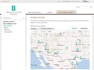
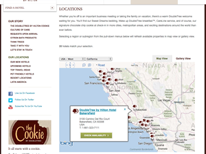
The main section I was responsible for was the "Locations" page, which used the Bing Maps API as its primary display (and also had a list view). A user could choose a region, and all hotels in that region would be dynamically displayed. The region could be narrowed down further into subregions to limit the view. In order to make sure the calls would work, I had to load in test data for the hotels and have the AJAX calls set up to retrieve the data. I had the raw XML data for Hilton Hotels to use as a test case.
Additional business requirements, such as bookmarking and disabled browsing, kept the project evolving. A number of requests were due to the scope of the project--while the prototypes handled as much as they could, there were some issues that were never going to be seen until an actual product existed. Pagination changed from being handled by the server to the client. Data was loaded via JSON rather than XML. The Locations page model was expanded so that it could be used for the New Hotels and Upcoming Hotels pages as well. I do my best to write adaptable code; those requests (and more) reminded me exactly why it's so important.
Other sections, while simpler, brought other issues to the table. Some content was brand-specific, but since we weren't the ones in control of the actual data, we used Apache includes to add in the appropriate content based on the brand. Templates needed to be coordinated with other similar sections (being worked on by different developers) to be consistent. In addition to the specific sections assigned to different developers, everyone on the team contributed to helping with QA for the different brands. We encountered obscure CSS bugs, JavaScript memory leaks, and all sorts of fun with IE7+ compatibility, to name a few. The official handoff of the code was a weight off our shoulders.
This was easily one of the most interesting and enjoyable projects I've worked on, from start to finish. Just due to the scope of the project, there was a tremendous amount to learn, not just from the sections I was responsible for, but in helping the other developers with their code and collaborating on ideas. Most of my past work had only been with one or two other developers at most, so working with a much larger team--not just the other developers, but managers that still knew their way around the code--let me see a number of perspectives from both technical and business points of view. While I was able to learn from the project, it also let me see that the knowledge I brought to the project was already solid.
SBC - HTML5 iPad app
Tech: HTML5, JavaScript, CSS, JSP, Groovy, MongoDB, Apache Tomcat
Link: Pre-production version (targeted for WebKit w/touch controls; designed for iPad 2 and later)
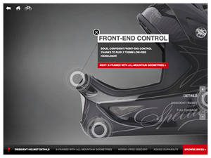
Some projects are just fun. Every project has a touch of the mundane to it when it gets to the details, but sometimes it's nice to work on a project where people walk by your computer and just shake their heads at what you're doing. For me, the Specialized Bicycle Components (SBC) in-store iPad app while working at Organic was one of those projects. I was the primary (and only) front-end developer, working with designers and other back-end developers based out of New York. The app was a great way to push the boundaries of what can be done in a browser.
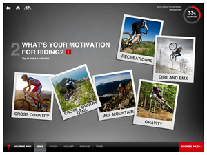
The app was created using HTML5 and wrapped with iOS, so that if needed it could be moved to Android without too much trouble. By targeting WebKit browsers, this opened up a number of possibilities. Most of the animations be handled through CSS, with JavaScript only present on animations for handling the classes. A circular progress meter was created entirely through CSS and JavaScript without actual images. The goal was to do as much of the graphics and animations as possible in ways that could be hardware-accelerated on an iPad through the browser rather than in software using JavaScript.
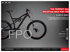
The other significant part of the app was that, as an iPad app, it was touch-enabled. The designers came up with a number of effects, and to implement them properly, I ended up writing a custom jQuery plugin. This included: allowing the user to pinch in and out to traverse through layers; a parallax view for a sliding menu; pages being draggable to view different parts; and other, smaller effects. (These effects are visible in the app on a touch-enabled device after answering the questionnaire and moving to the next page.) The plugin helped me look at the functionality from a generic viewpoint, so that it would adapt to different content that could possibly be included. And, it's a handy piece of code that's now in my toolbox for touch interactions.
This was a project where the question wasn't, "How can we make this compatible across all browsers?", but instead asked, "What cool stuff can we do in a sophisticated browser?". While backwards compatibility (and, of course, IE compatibility) should be part of most web implementations, not having compatibility as a concern allows the designers to only think of the ideal end product, and it allows the developer to help the designers see what is actually possible. Not just what can't be done, which is usually the case, but in addition what ideas are possible that the designer might not even know about. It's a nice feeling when the focus can move away from what's technically possible to simply creating the best product.
U By Kotex - promotional minisite
Tech: HTML/CSS, JavaScript (jQuery), .NET (C#), Photoshop
Link: http://www.kotex.com/..
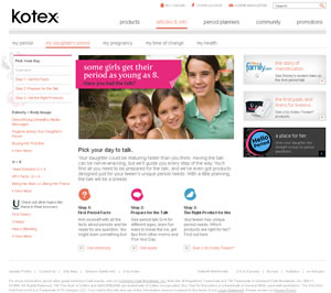
After working on a number of projects with only one or two other people working on the entire site, the minisite I created for the Kotex.com website was my first project with Organic, and it was the first project where I worked with a full team of specialized individuals. It was a very different experience for me, but in a good way. While I've worked on high traffic sites in the past, this was the first within a public, corporate structure.
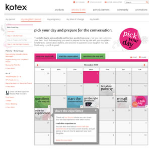
My role on this site was the front-end web programmer. The site had a number of interactive elements, and it would need both JavaScript and ASP support. I learned later that the ideas were conceived by the designers without any idea of what was involved or what the developers would say. They (rightfully) assumed that if something couldn't be done, someone on the development team would say something. Personally, I loved the thought process behind that decision--why not think big and see what's possible? I wasn't with the company when the ideas were first presented, but I wouldn't have raised any concerns with what was being asked for within the timeframe.
When the project was completed, I had created and modified the ASP views and C# code, integrating them with the front end HTML and JavaScript with the normal CSS. I worked with project managers, developers, copywriters, designers, and quality assurance testers throughout the development cycle. While I still enjoy building projects on my own and handling a little of everything, I definitely don't mind the benefits that come with working with a complete team. Everyone, from the designers to the client, were happy with how the build came out, and while I can't take as much credit as I have in previous projects, I'm still proud that I handled my role and did it well.
Tracking Tool - healthy activity recording
Tech: PHP (w/object-oriented framework), PostGreSQL, JavaScript (jQuery), XHTML/CSS
Link: Unavailable (proprietary SaaS platform)
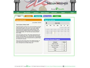
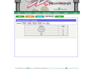
Asset Health is a company that provides employers with a variety of methods to improve the overall health of their employees. One method is a web application that allows an employee to track their healthy activities and subsequently reward those employees for what they have recorded. On this project, I co-designed the application with regards to the functionality and features, and I was the primary developer as well. (Due to the proprietary nature of the application, no links are available.)
As a designer of this application, I worked with the Vice President of my department, who had been trying to implement this application for a few years. We discussed all aspects of how the application would work, including the list of features desired for both launch and the future, the application flow, the look and feel, and the functionality that would be included. My primary concern through the design process was the usability of the application. While there is a wide range of features that can be added through JavaScript, I wanted to make sure that every dynamic call was done intelligently and for a purpose.
The development of this application was involved, to say the least. One issue was that I was required to learn a custom PHP framework that had been developed by an outside vendor. Although I had made minor updates to the code base, our company had up until this point sent a majority of work through the vendor rather than keeping the work in-house. I spent a week working with the programmers at the vendor and made sure that I understood their framework as well as the reasons that certain aspects were developed the way they were. By understanding their system, other parts of the framework that I thought I previously understood became much more clear as to exactly how and why they were developed.
The interface itself was enjoyable to design. I was able to push some boundaries with regards to what was done dynamically compared to anywhere else on the site. Because of that, I had next to nothing (with regards to internal code) to use as a reference for some of the work I was doing. This let me create the framework for parts of the project and to help guide the application in the way it could--and should--go in the future.
With this project, I also had the opportunity to have live beta testers. The tracking tool is currently used for Asset Health's internal health initiative. By being a member of that initiative, I have been able to get real-time feedback on the application on a constant basis. I've made improvements to both the usability and the functionality of the application through that feedback by being able to speak one-on-one with people who actually use the application.
Overall, the application is now a prominent feature that Asset Health markets to prospective customers. I was able to improve my skills through the project, both in usability testing and in dynamic application development. Some projects give more opportunities to learn and grow, and this one was better than most in that regard.
